6369945_designing-brand-identity
by Alina Wheeler
Brand identity fails not from bad design, but from skipping strategy—learn the proven system where every logo, name, and visual decision flows from research…
In Brief
Designing Brand Identity: An Essential Guide for the Whole Branding Team (2003) establishes brand identity as a strategic discipline, not a purely creative one. It walks the full branding team through research, naming, visual system design, and rollout — providing a repeatable process that produces identities built to last beyond any single project or designer.
Key Ideas
Strategy Before Design Execution
Never begin visual work before completing a brand brief. The brief is the finished product of the strategy phase — design that precedes it is speculation, and the revision costs will exceed whatever time was 'saved.'
Comprehensive Brand Name Testing Protocol
Run every name finalist through a four-part test: trademark database, domain availability, the name in other languages, and Urban Dictionary. Then say it aloud to a wide range of people — from a grandmother to a senior executive — before selecting and immediately buying every available domain variant.
One Solution, Not Multiple Options
Present one fully developed solution to clients, not a menu of routes. Presenting multiple options signals uncertainty, not generosity. Keep alternatives internally as a safety net, but pour all energy into making the primary concept bulletproof.
Reflection Time Between Major Milestones
Build a week-long reflection period between every major project milestone. Clients need time to digest and form considered feedback; premature feedback built on incomplete work sends the project in the wrong direction.
Easy Approval Requires Internal Validation
Treat frictionless client approval as a warning sign. Schedule an active internal validation review after easy sign-off: ask whether the work can be better, more effective, or more refined before treating consensus as quality confirmation.
Logos Require Full Application Context
Never show a logo before the full application deck is ready. Context — thirty or more pages showing the mark living across touchpoints — is what converts skeptical stakeholders. A mark shown in isolation will be misread.
Screen Voiceovers Improve Client Preparation
Consider recording a ten-minute screen voiceover of every proposal before a live meeting. Clients receive it first, replay it, share it internally, and arrive at the meeting with considered feedback instead of reactive first impressions.
Guidelines Enable Continued Creative Expansion
Treat brand guidelines as the infrastructure for a second creative expansion, not as proof the project is finished. Every touchpoint at rollout is an opportunity to maximize the identity's impact — deployment is where design investment compounds.
Who Should Read This
Business operators, founders, and managers interested in Branding and Design Thinking who want frameworks they can apply this week.
Designing Brand Identity: An Essential Guide for the Whole Branding Team
By Alina Wheeler
9 min read
Why does it matter? Because the most expensive branding mistakes don't happen during design — they happen in the weeks before it starts.
You probably think branding is the part where you choose fonts. So did the author, early in her career — until she noticed that every project done without a proper strategy landed in the same place: a client requesting changes no one could justify, a designer defending choices with no foundation, and a revision spiral that felt, to both sides, like punishment for something neither had put into words. The logo wasn't the problem. The absence of anything upstream of the logo was. What most people call "branding" (the visual work, the mark, the palette) is actually the final layer of an infrastructure project that should have started months earlier with research, positioning, and a documented brief. Every step skipped before that brief exists gets paid back, with interest, during execution.
Your Brand Strategy Was Written the Moment You Skipped It
Skipping brand strategy is itself a strategic decision: the choice to let the visuals lead before anyone has agreed what the brand stands for, who it's talking to, or why those people should care.
The inclination is understandable. Strategy is slow and produces nothing tangible. A logo feels like movement. Stakeholders can react to it. Clients can show it to their co-founders. Starting with visual work signals progress because something is actually being made.
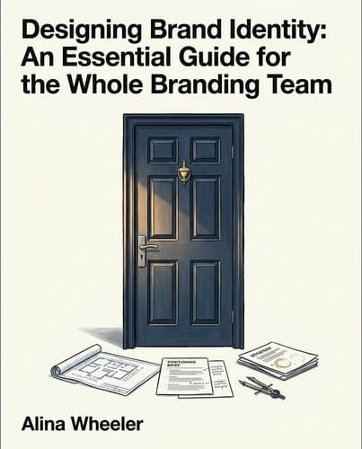
The cleanest way to see it is a single image. Building a brand identity outward from a logo is structurally identical to buying a front door before the foundation is poured. It works because it's about sequence. A door needs a frame. A frame needs a wall. A wall needs a foundation. Each component only functions in relation to everything else. You can't reverse-engineer structural integrity from the most visible surface element. The same logic applies to identity work: a logo without a defined tone, a clear positioning, and a color system grounded in meaning isn't an identity in embryo. It's an isolated object with nowhere to connect. The visual decisions — which typefaces, which colors, what the lockup communicates — only become answerable once the strategy has established what the brand means and who it exists for.
This was the pattern in my own early work, and it took an embarrassingly long time to name it. I produced visuals disconnected from any strategic foundation, and neither I nor my clients could name the problem because neither of us had named what was missing. We kept iterating. Without a strategic anchor, every client note eventually becomes a matter of personal taste: the color is wrong, the mark feels dated, the tagline doesn't land. The client can't explain why the third round of options still feels off — because what they're actually missing is language for what's absent, not opinions about what's present. Revisions multiply. Frustration builds.
The trap is that skipping strategy feels like deferring a decision. It is the decision.
The Brief Is Not Where Creative Work Starts — It's Where Strategy Ends
Think of a brief the way an architect thinks of a blueprint. A blueprint doesn't start the design process — it concludes the site surveys, the client interviews, the structural assessments. When you see it, the hardest thinking is already done. The brief in brand work functions the same way: a record of everything the strategy phase uncovered, compressed into a document both parties can navigate from.
What comes before it matters more than most designers realize. The standard shortcut is a questionnaire: send it to the client, collect answers, frame the creative. It seems efficient. The problem is structural. A questionnaire captures what people are willing to write down when no one is watching — what they want to say about themselves, not what's true. Clients will describe their brand as bold and progressive when what you're actually looking at is cautious and derivative. They're not lying. They're describing the company as they wish it were, without anyone in the room to ask the follow-up.
A workshop does something different. Face-to-face, with a facilitator guiding the conversation, things surface that no questionnaire would dislodge: the gap between what leadership believes and what staff experience, the customer perception that contradicts internal assumptions, the founding conviction that hasn't yet been translated into anything a stranger could encounter. The facilitator's job isn't to take notes. It's to hold the room, push on comfortable answers that don't hold up, and keep going until something real emerges.
That process is what makes the brief possible. A good brief is the whole navigation system in one document: the destination, the route, and how you'll know when you've arrived. Startups hungry to move fast will resist the weeks this takes. But a brief written without that groundwork is a guess in document form. When the creative work drifts — and if you've built on incomplete premises, it will — client and designer spend months trying to correct for a foundation that was never there.
Before You Design Anything, Run the Name Through Urban Dictionary
How many names die on a whiteboard that would have died anyway — killed later by a lawyer, a language barrier, or an Urban Dictionary entry?
Naming feels like a creative problem: someone proposes something that sounds right, the room reacts, a name emerges. The process the book describes is nothing like that. It's a funnel, and creativity is only at the wide end.
Start with the brand's own language: the dynamic adjectives already in the mission statement often point directly to a name or unlock one. Map competitor names to see what territory to avoid. Check the brand's history for anything worth carrying forward. On a client project naming London's first Versaclimber studio (a full-body climbing machine built around the meditative euphoria of reaching a mountain summit), the designer knew nothing about climbing and turned to Google. Technical vocabulary appeared: "headwall" (the steepening rock face near a summit), "serac" (a tower of glacial ice). Neither was a cliché. The fitness industry drowns in "peak performance" language; genuine specialist vocabulary signals something different. The eventual name, Seraclimb, won quickly.
But generating good candidates is only the beginning. Once you have three finalists, you run them through a sequence most naming sessions never reach. Trademark databases first, because mid-project name changes are expensive and they happen. Then URLs, social handles, and translations: a name that reads as aspirational in English can mean something rude in another market. Then come two tests that almost never appear in naming advice: run each finalist through Urban Dictionary, and say every name aloud to the widest range of people you can find (from a grandmother to a company executive). Each test catches a different failure mode. Urban Dictionary surfaces slang meanings that standard translation tools miss. The spoken test finds names that look fine on paper but break down in actual conversation: mispronounced, awkward to repeat, or carrying a tone that doesn't survive the room.
Once a name passes every stage, buy every domain variant you can and file the trademark application that week. The window between choosing and protecting is where things disappear.
The Logo Reveal at Page Two Means Nothing — Keep Going to Page Thirty
Wheeler walks into a boardroom with a brand identity proposal. She opens the deck. A few slides in, the brand mark appears — and she watches the faces around the table fall. Not politely skeptical. Actually fallen.
She doesn't stop. Doesn't explain or apologize. Keeps going.
Thirty-plus pages follow: the mark on packaging, on signage, on clothing, on screens. By page fifteen, the same faces that fell at the brand mark are nodding. The system had become legible because they'd watched it assemble.
What designers consistently underestimate: a logo shown in isolation is almost never the logo. It's an abstraction. People evaluate marks the way they evaluate everything: in context, in conditions of use. Pull a letter out of a sentence and it looks strange. Show a brand mark floating on a white slide and you're asking your client to imagine a building from a single brick. The board wasn't wrong to react badly. They were right. Strip the mark from its application and it's a shape that doesn't yet mean anything.
The deck is not a formality tacked onto the real work. It's where the design becomes legible. Every mockup — the mark on a tote bag, on a website header, on a storefront — argues for the client's ability to see it working, not its quality. Function is what skeptics need before they can commit.
Here's the uncomfortable part: none of this is about the design. The boardroom didn't change its mind because the mark improved between page two and page fifteen. The design was identical. What changed was what the board understood about it. The hardest work in brand identity is not making the mark. It's managing the conditions under which someone sees it for the first time.
The fix I've landed on: before any live meeting, record a ten-minute screen walkthrough of the deck. Narrate each decision. Walk through the brief summary, the strategy rationale, the application pages. Send it to the client the night before. Give them a day or two to watch it, rewatch it, share it with whoever else will be in the room. When the live meeting happens, the first reaction has already been absorbed privately, at their own pace, without anyone watching. What you get in the room is considered feedback instead of a boardroom reflex.
The presentation is a design problem. You are designing the conditions under which your work will be understood.
The Most Dangerous Client Is the One Who Never Pushes Back
Designing how work gets received is one problem. A quieter one is what to do when it lands too easily.
The most dangerous client approval is unanimous. Not the hard-won kind, where the room debated and the work earned its consensus — the frictionless kind, where one dominant voice championed the design and everyone else fell into line. That moment feels like a win. It is not.
When a senior stakeholder signals they love a direction, dissent becomes socially expensive for everyone else in the room. The junior product manager who felt something was off stays quiet. The operations lead with a nagging question doesn't raise it. The work sails through, and nobody reviews what nobody questioned.
The creative team is in the same trap. Deep in execution, finessing the spacing, refining the palette, making the system cohere, they've lost the altitude to see the overall picture. You can't see the horizon while staring at a detail. Both sides are now fully committed to something neither has properly examined.
The real danger is the lag. A flawed identity doesn't announce itself at launch. It surfaces when the brand fails to connect with its audience, or when the system breaks down at scale. By then the approval is ancient history and the creative partner's reputation is attached to the outcome. Clients trust designers to deliver something that holds up. Signing off quietly on a system that can't meet its objectives is an abdication of that trust.
The fix is to manufacture doubt after the room has already agreed. Build in a review checkpoint, with the client present, around one question: what could this do better? If the answer stalls, external testing (real users, audience groups) reintroduces the friction the approval process eliminated.
The worst-case scenario in brand identity work is an easy client. Easy approvals skip the review that hard ones force.
Brand Guidelines Are Not the Finish Line — They're the Starting Pistol
Think of an hourglass. The wide top is where all the creative energy pools: research, naming, strategy, the grinding refinement of the mark. Everything funnels toward a single narrow point: the moment the final identity locks. Most designers treat that bottleneck as the finish line. The work is done. Guidelines get written. Assets get packaged. The invoice goes out.
But the hourglass has a second wide opening. That's what gets missed.
After the narrow point, creative energy expands again. Every touchpoint — signage, packaging, digital templates, the way a social post gets cropped — is a chance to make the system feel inevitable rather than assembled. Be adventurous in how you interpret the identity across applications. That's not decoration advice. It's a warning against safe, box-checking rollouts where every asset technically complies but nothing feels coherent.
Guidelines are the infrastructure for this phase, not the evidence that it's over. There's a particular irony in badly constructed guidelines: a document meant to communicate brand vitality that reads like a corporate compliance manual. Dry, hierarchical, exhaustive in the wrong direction. If the guidelines feel like something people want to avoid, they've already failed at their primary job.
The final delivery marks the completion of the first task: statement of work signed off, artwork approved, invoice out the door. The brand toolkit is built to last twelve to eighteen months, a runway, not a permanent structure. What happens after handoff determines whether the system grows or quietly degrades. The designer's role shifts from maker to steward — someone whose work is measured not by the boardroom reveal but by what holds together when the brief is two years old and the original team has moved on. The real measure isn't the mark itself. It's whether the thing you built keeps working without you.
The Real Test of a Brand Begins the Day You Walk Away
The approval, the launch party, the press release — these mark the moment a brand system becomes someone else's problem to maintain. That's not cynicism. It's the actual measure. You can produce something beautiful enough to dazzle a boardroom in a single afternoon. The harder achievement is producing something logical enough that whoever inherits it two years from now (without you in the room, without the conversation about why this typeface and not that one, why this tone and not a warmer one) can extend it faithfully without breaking what it already means. The best identity work is not a visual artifact. It's the guidelines document: an argument for why this brand deserves to exist and what it promises the people who encounter it. Your job doesn't end when the system launches. That's when you find out whether you actually built one.
Notable Quotes
“for the love of the big screen”
“was split into individual letters, and a scene was illustrated around each. Abstract shapes and three-dimensional settings include subtle hints around the meaning of the word”
“) with evocative summit-inspired words like”
Frequently Asked Questions
- What is 'Designing Brand Identity' about?
- "Designing Brand Identity: An Essential Guide for the Whole Branding Team" (2003) establishes brand identity as a strategic discipline rather than a purely creative exercise. Written by Alina Wheeler, the book guides branding teams through research, naming, visual system design, and rollout—providing a repeatable process for creating identities built to endure. The work emphasizes that successful branding requires strategic thinking, client management, and disciplined execution beyond isolated creative brilliance.
- What should you complete before starting visual design on a brand?
- Never begin visual work before completing a brand brief. The brief represents the finished product of the strategy phase—design that precedes it is speculation, and revision costs will exceed any time initially saved. This foundational principle prevents wasted effort and expensive corrections stemming from visual work built on incomplete strategic thinking. Wheeler emphasizes that proceeding to design without complete strategic grounding creates costly downstream problems that undermine project timelines and budgets.
- How many design options should you present to clients?
- Present one fully developed solution to clients, not a menu of routes. Presenting multiple alternatives signals uncertainty rather than generosity—a single polished concept demonstrates confidence and strategic thinking. Keep alternative ideas internally as a safety net, but concentrate all effort on making the primary concept absolutely compelling and resilient to scrutiny. This approach prevents decision paralysis, clarifies strategic direction, and demonstrates that the team has made considered, deliberate choices rather than passing the decision burden to stakeholders.
- Why shouldn't you show a logo before the full application deck?
- Never show a logo before the full application deck is ready. Context—thirty or more pages showing the mark living across touchpoints—is what converts skeptical stakeholders. A mark shown in isolation will be misread, lacking the systems and applications that reveal its true power and versatility. Wheeler stresses that logos are meaningless without the broader identity system they anchor. The complete deck demonstrates consistency, application flexibility, and strategic coherence, transforming an abstract symbol into a comprehensive brand solution stakeholders can genuinely evaluate.
Related Book Summaries


Read the full summary of 6369945_designing-brand-identity on InShort